Choosing the right adjective can be a challenge. For example, let's say you want to precisely describe how good you think something is. Sure, you could just say "It's good", but what if the thing you're describing is better than that?
Perhaps it's "quite good". Or "really good". Maybe it's even "very good", but is that better than something that's really good?
What if it's "awesome"? Is something that's awesome better than something that's very good? Not knowing whether it is or not can lead to some really "mediocre" if not "rubbish" attempts to communicate on your part.
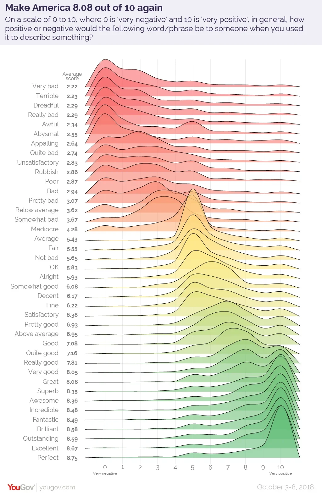
Fortunately, YouGov ran a poll back in 2018 to assign a score to the common English words and phrases Americans frequently use to describe how either positive or negative they think something is. The results are graphically depicted in the following chart, which can be used as a tool to precisely dial your description of how good something is by choosing the right adjective to convey what you really think about it:
Now, when you describe something as "decent", it's because you mean it's better than "alright", but isn't quite as good as something you think is "fine". Isn't that "fantastic", which you now know is just a tick better than "incredible"?
Labels: data visualization
Computing technology continues to increase in capability every year. For hackers with top-of-the-line equipment, it is easier than ever for them to run through millions of combinations of characters to discover your passwords than ever before.
But how long that might take them still depends on how many characters long it is and what combinations of numbers, lower case letters, upper case letters, and special characters you use in your password.
Hive Systems has updated their "Time It Takes a Hacker to Brute Force Your Password" infographic for 2024. Here is the table:
Hive Systems' Corey Neskey's offers a discussion of how they determined the amount of time it would take a hacker to discover your password by trying all possible combinations of different sets of characters.
And for the record, if any of your passwords have been exposed to hackers through a data breach, the amount of time it takes a hacker to get into your account using that password is described as "instantly". Or in other words, it's time for you to change those breached passwords to something much longer with many more kinds of characters.
Labels: data visualization
Here's a problem from real life in early 2024. Let's say you're thinking about taking the plunge and getting an electric-powered vehicle. Whether it's because you want to be seen as someone who cares about the environment or it's because you really like the idea of having the power of instantaneous torque when you step on the accelerator, getting an EV is something you've decided to do.
But because the technology is changing so quickly and because electric vehicle prices are falling, you don't want to lock yourself into owning an electric vehicle. You're looking to lease one for a few years instead.
Sound plausible so far? Okay, let's get really specific. Let's say you've narrowed your options and are thinking about leasing a $38,990 Tesla Model 3, which has a down payment of $2,999. The lease payment is $299 a month for three years, and at the end of the lease term the car’s market value is projected to be about 67% of its original value. What is the effective interest rate you'll pay for this leasing deal?
That's not so easy a question to answer because even if you have the right formula to plug all these numbers into, because there's no straightforward way to rearrange that equation to simply solve it for the interest rate. You'll either have to use trial and error to get to that answer or you'll need to apply some advanced math and run through a series of calculations to get to a precise approximation.
Unless you're willing to trade a little accuracy to get to a still reasonably accurate result. There is a relatively simple equation that can calculate an approximate value for the interest rate, which we've built the following tool to do. If you've accessing this article on a site that republishes our RSS news feed, please click through to our site to access a working version of the tool.
The result of the tool should give you a reasonable estimate of the effective interest rate you're paying to take out this lease. For the default values in our leasing scenario, that result is 5.73%.
But if you have other numbers, by all means, take the tool for a test drive with them! And if you can get the actual lease interest rate, compare your results to see how close the approximation behind this got to the exact result!
Image credit: Tesla Model 3 (2023) by Kazyakurumaon Wikimedia Commons. Creative Commons CCO 1.0 DEED CC0 1.0 Universal .
Labels: personal finance, tool
Later this week, on Thursday, 25 April 2024, the Bureau of Economic Analysis will publish its first estimate of the United States' Gross Domestic Product during the first quarter of 2024.
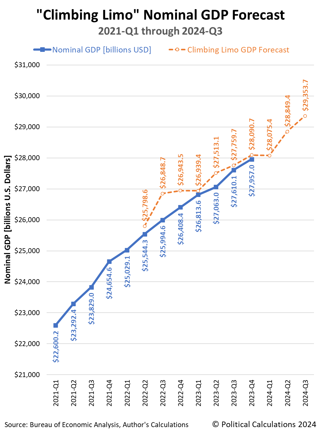
Because that date is so close, it's a good opportunity to check in with how 2024-Q1's GDP tracks with what a momentum-based forecasting method projected it would be for this quarter over seven months ago. That simple method, called the "Climbing Limo", uses nominal GDP data that was available back in September 2023 in its projections.
The following chart reveals how closely that method worked for anticipating the final GDP estimate for the fourth quarter of 2023 (2023-Q4), which only became available last month. As you can see, there's only a half-percent difference between the forecast for 2023-Q4's nominal GDP and the BEA's official estimate for the quarter.
If the Atlanta Fed's GDPNow forecast for 2024-Q1 is right, this quarter could be the first in which actual GDP exceeds the climbing limo's momentum-based forecast in the period covered by the chart.
Which means nearly nothing. That's because when economic growth is relatively stable, it's common for forecast and actual GDP data series to periodically cross over each other just based on variation in the data. For the period shown on the chart, which presents the Climbing Limo forecast using only the actual GDP data shown on the chart, it has been unusual for actual GDP to have so consistently underperformed the momentum-based forecast.
That could be because inflation, which is built into the nominal GDP estimates, has been slowing over this period. But there are other potential explanations that could account for that pattern as well, including slowing momentum in the U.S. economy after the initial phase of the post-Coronavirus Recession recovery.
Regardless, it will be another two months before we get the BEA's final GDP estimate for the first quarter of 2024 to see how good the Climbing Limo's forecast for 2024-Q1 turned out to be.
Looking much further forward, since the GDP data for 2023-Q4 has been finalized, the Climbing Limo method projection using that data point suggests some rather robust GDP growth through the third quarter of 2024. Unfortunately, it will be months before we find out how good that forecast is. As a general rule of thumb, it's usually within a few percentage points of the actual GDP estimate, but that can change if the economy turns a proverbial corner, either for the better or for the worse. In either of these cases, a comparison with the Climbing Limo forecast provides a useful confirmation of which situation applies.
Update 25 April 2025
The BEA issued its first estimate of nominal GDP for 2024-Q1: $28,284.5 billion. That figure is 0.7% higher than the seven-month old climbing limo forecast of $28,075.4 billion, so reported GDP has crossed above the climbing limo projection. The BEA will finalize its GDP estimate for the quarter, at least outside of its annual revisions, at the end of June 2024. Most news reporting is focusing on the inflation-adjusted "real" GDP figures coming in lower than had been forecast. The first estimate of the real growth rate for 2024-Q1 is 1.6%, the Atlanta Fed's GDPNow forecast tool had antipated 2.7% growth as recently as 24 April 2024.
References
U.S. Bureau of Economic Analysis. National Income and Product Accounts. Table 1.1.5. Gross Domestic Product. [Online Database]. Accessed 21 April 2024.
Political Calculations. Forecasting GDP Using the Climbing Limo. [Online Tool]. 10 May 2005.
Image Credit: Microsoft Copilot Designer. Prompt: "A limousine with the letters 'GDP' driving upward to the top of a hill on a very rocky road, with the limousine driving on the rocks".
Labels: gdp forecast
The S&P 500 (Index: SPX) fell again durin ghte third week of April 2024. The index closed out the week at 4,967.23, a little over three percent below the level it closed the second week. The index has dropped 5.5% below its record peak closing value from 28 March 2024.
The main driving force behind the falling level of stock prices are slipping expectations for when and by how much the Federal Reserve will cut interest rates during 2024. The CME Group's FedWatch Tool anticipates the Fed will hold the Federal Funds Rate steady in a target range of 5.25-5.50% until 18 September (2024-Q3) when a quarter point reduction is expected, some twelve weeks longer than expected just a week earlier. The tool also projects only one rate cut in 2024, the timing of which is looking uncertain.
As we illustrated in a separate analysis, that slipping timing is reducing the expected level of dividends in future quarters. Right now, we think investors have been scared by the "no rate cut" bear into shifting their forward-looking focus to either 2024-Q3 or 2024-Q4, with their investment time horizon being affected by the sliding expectations for when the Fed might alter the level of short term interest rates in the U.S.
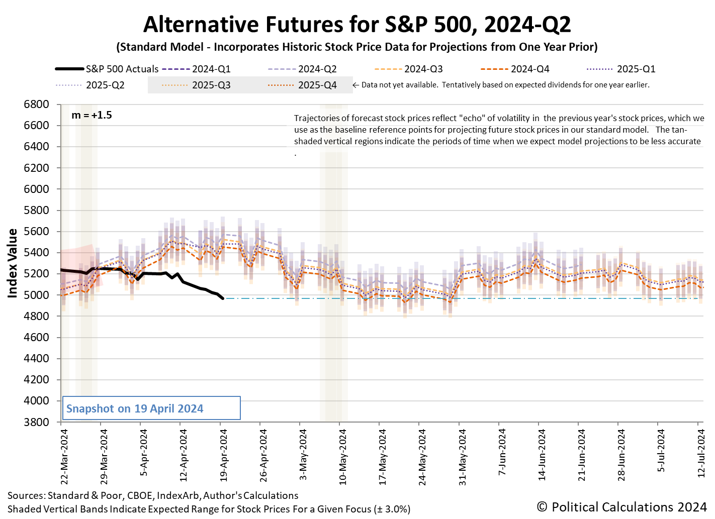
We're basing that hypothesis on the level the dividend futures-based model is projecting the potential level of the S&P 500 will be a month from now as we're within the month-long window in which its projections have "locked in". The latest update for the alternative futures chart shows the current level of the index is consistent with the model's still-dynamic projections outside of the locked-in period:
An alternate explanation is the stock market is experiencing a regime change, in which the dividend futures-based model's basic multiplier has changed, but we would need several more weeks of data to confirm if that is the case. We're weighing these scenarios behind the scenes, where we haven't yet seen sufficient data to determine the established value of the multiplier has definitively broken from the level it has held since 9 March 2023.
In the meantime, the context provided by the market-moving headlines of the week points to that market regime still holding. The week's headlines point to the rapidly slipping expected timing of rate cuts in 2024, which continued in the past week, as the continuing culprit in the decline of stock prices during the last several weeks.
- Monday, 15 April 2024
-
- Signs and portents for the U.S. economy:
- US growth may be a global boon, but inflation could derail the train
- Oil slips as risk premium eases after Iran attack
- Fed minions say they won't rush to cut rates until they need to see data pointing to wage inflation:
- Fed should not act urgently to cut rates unless required, Daly says
- US workers seeking record wages to consider new jobs, New York Fed says
- Fed's reverse repo facility plummets to lowest level in nearly three years
- Bigger trouble, stimulus developing in China:
- China's Q1 GDP growth likely to slow, more stimulus on the cards
- China c.bank keeps policy rate unchanged, drains cash from banking system
- Economic growth signs in Japan:
- Nasdaq, S&P, and Dow ended notably lower while yields rallied once again
- Tuesday, 16 April 2024
-
- Signs and portents for the U.S. economy:
- US single-family housing starts plunge in March
- Oil slips as concern eases about Middle East supply risk
- US manufacturing output increases in March; February data revised higher
- In reversal, Fed minions claim they need more time to combat inflation before they can cut rates:
- Federal Reserve's restrictive policy needs more time to work, Jerome Powell says
- Fed could keep monetary policy tight for longer if needed, Jefferson says
- Bigger trouble, stimulus developing in China as Q1 growth better than expected:
- China's Q1 GDP grows 5.3% y/y, well above forecast
- China's cycle of dollar hoarding and weakening yuan gets vicious
- China's new home prices decline at fastest pace since 2015
- Chinese city Zhengzhou tells state-owned company to buy second-hand homes to reduce new housing inventories
- Nasdaq, S&P, Dow end mixed after hawkish Powell further clouds rate cut expectations
- Wednesday, 17 April 2024
-
- Signs and portents for the U.S. economy:
- US regional banks seen booking more commercial property losses, loan sales
- Oil dips as demand worries outweigh Middle East supply risks
- US wheat farmers face bleak crop economics as grain oversupply hits
- Fed minions say they're in "no hurry" to cut interest rates:
- Bigger trouble, stimulus developing in China:
- ECB minions looking forward to cutting Eurozone interest rates, don't want to review their inflation target anytime soon:
- ECB firmly behind June rate cut but views diverge on July
- ECB's Vasle sees rates much closer to 3% at year-end
- ECB's Centeno says policy would be tight even after two rate cuts
- ECB's Lagarde hints it is too early to review inflation target
- Nasdaq sheds more than 1%, S&P posts four-day losing streak, Dow slips slightly
- Thursday, 18 April 2024
-
- Signs and portents for the U.S. economy:
- Oil extends losses on easing Middle East tension, demand concerns
- Mortgage rates top 7% for the first time this year, Freddie Mac says
- Fed minions now saying they're in no "mad dash hurry" to cut interest rates:
- Fed's Bostic says he is not in a 'mad dash hurry' on rate cuts
- Fed's Williams doesn't see urgent need to cut interest rates
- BOJ minions promise future rate hikes will be slow:
- BOJ's Noguchi says future rate hikes likely to be slow
- BOJ's Ueda signals possible rate hike if weak yen boosts inflation
- ECB minions say they're "crystal clear" on cutting Eurozone interest rates in June:
- ECB 'crystal clear' on June rate cut, de Guindos says
- German home building permits tumble 18% in February, extending rout
- S&P posts five-day loss for first time since Oct, Nasdaq & Dow end mixed; eyes on Netflix
- Friday, 19 April 2024
-
- Signs and portents for the U.S. economy:
- Oil settles slightly higher as Iran plays down reported Israeli attack
- Fed says 1,804 banks and other institutions tapped emergency lending facility
- IMF minions getting mad at Fed minions; Fed minions say they're doing nothing because Bidenflation not going away:
- Fed's rate-cut foot-dragging grates on global peers at IMF meetings
- Fed policy on hold because of 'stalled' progress on inflation, Goolsbee says
- Bigger trouble, stimulus developing in China:
- BOJ minions say rate hikes are coming:
- ECB minions say inflation could go either way:
- Wall Street's April pullback intensifies as S&P 500 notches worst week in over a year
The Atlanta Fed's GDPNow tool's latest estimate of real GDP growth for the first quarter of 2024 (2024-Q1) rose to +2.9% from the +2.4% growth forecast last week.
Image credit: Microsoft Bing Image Creator. Prompt: "An editorial cartoon of a bear with a sign that says 'NO RATE CUTS' scaring Wall Street traders"
Welcome to the blogosphere's toolchest! Here, unlike other blogs dedicated to analyzing current events, we create easy-to-use, simple tools to do the math related to them so you can get in on the action too! If you would like to learn more about these tools, or if you would like to contribute ideas to develop for this blog, please e-mail us at:
ironman at politicalcalculations
Thanks in advance!
Closing values for previous trading day.
This site is primarily powered by:
CSS Validation
RSS Site Feed
JavaScript
The tools on this site are built using JavaScript. If you would like to learn more, one of the best free resources on the web is available at W3Schools.com.


